How Does CardioLog Analytics SaaS Work?
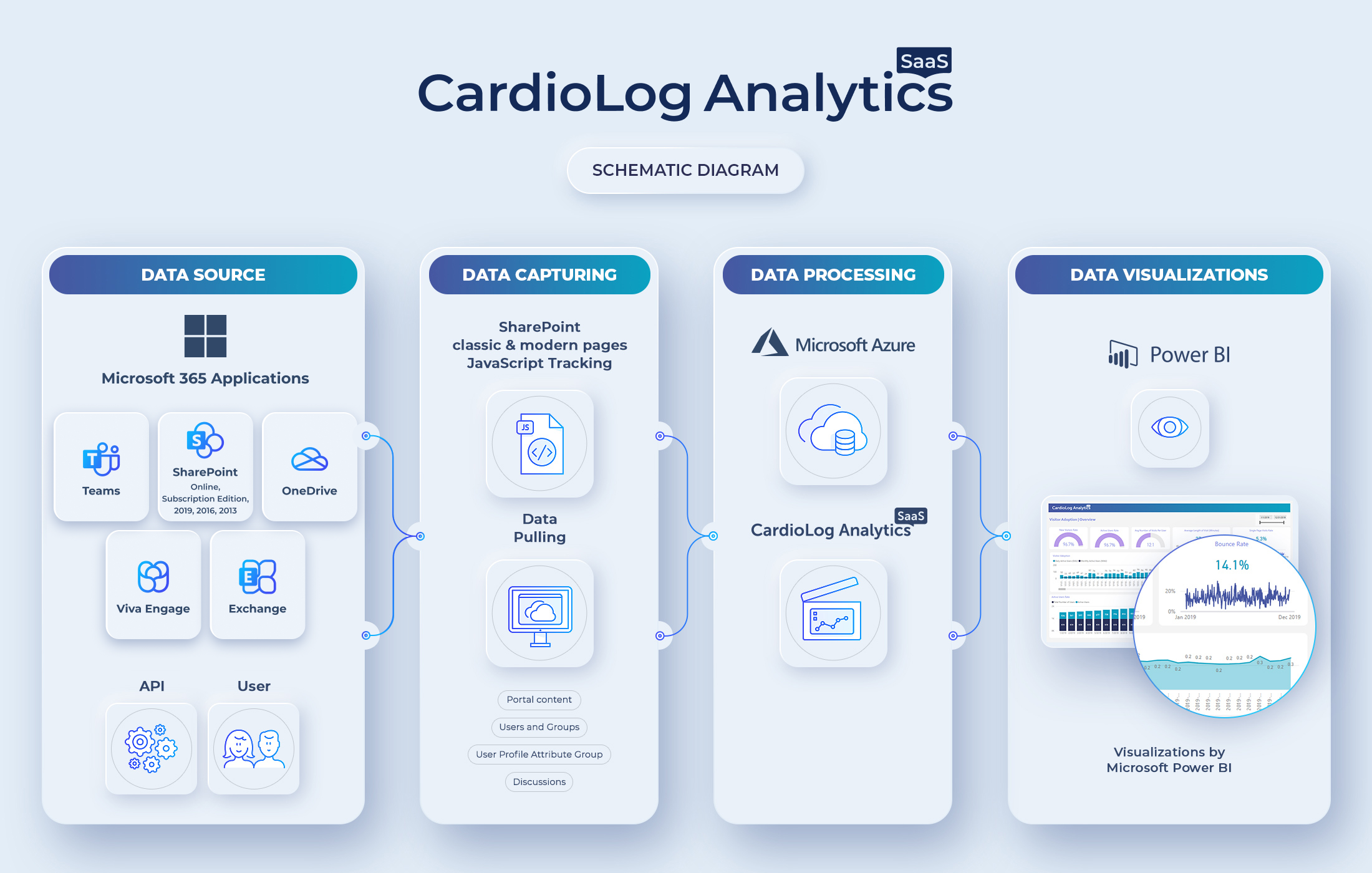
CardioLog Analytics SaaS’s architecture is built upon four main layers. The first layer illustrated below is the “Data Source” layer. This includes all the main sources that CardioLog Analytics SaaS can track, including Microsoft Office 365, SharePoint (Online, 2019, 2016, 2013), and Viva Engage (Yammer). At this stage, the solution combines tracking of user behavior with data pulled from various APIs. The user behavior is captured by a JavaScript code, which allows for tracking all kinds of information including what pages users viewed and what they searched for. This data is combined with information that we get from SharePoint and Viva Engage (Yammer) APIs. This mechanism allows for the capturing of much more information, like portal content, structure, users, groups, profile attributes and much more that allows you to filter and segment your reports. This provides information beyond what’s attainable by just tracking user behavior.
Once data is captured, there is a mechanism that processes the data and combines it into analytics that are displayed in reports. Finally, the information is displayed at the data visualization level. The data is visualized through Power BI, a powerful visualization agent provided by Microsoft. The data is processed and then displayed in a very attractive way, allowing the user to attain important insights regarding their Microsoft Office 365 portal.