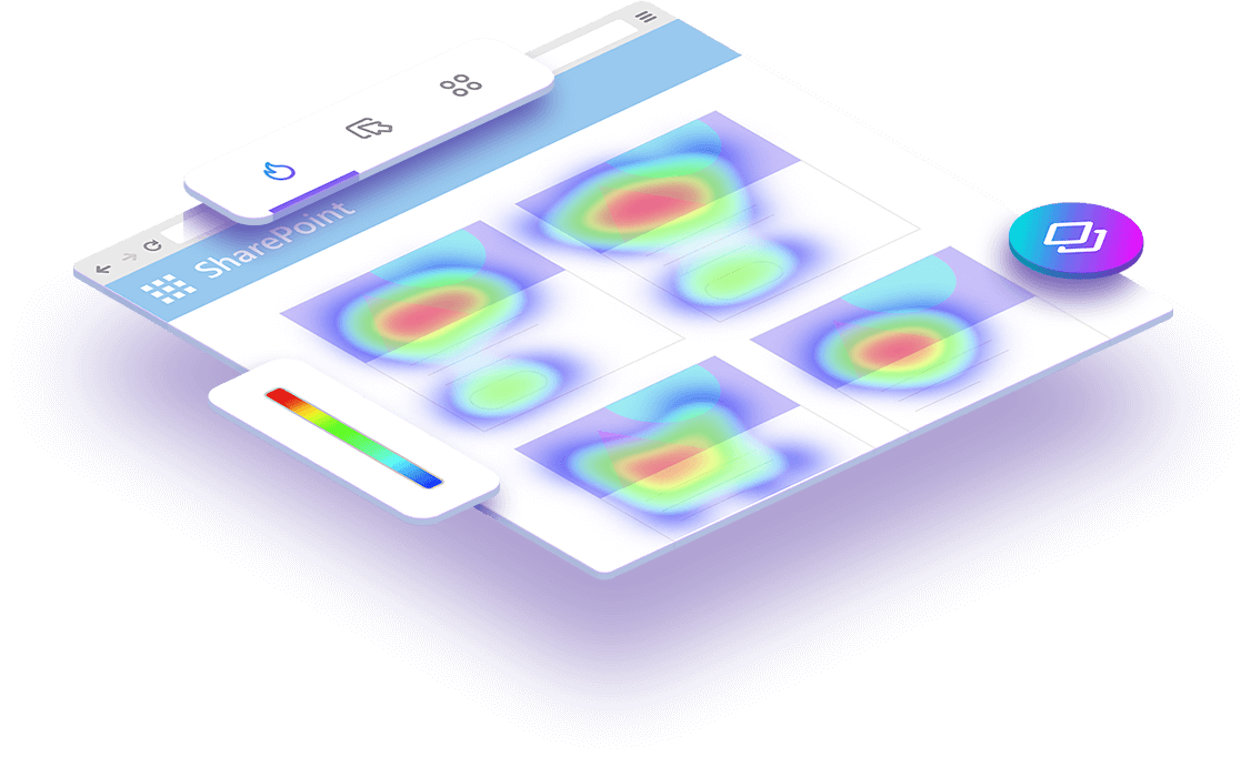
Heat Map
A heat map is a visual representation of data where values are depicted by color and they make it easy to understand complex data at a glance
Heat Map
Heatmaps are a powerful way to understand what users do on your organizations’ SharePoint site. These maps make it easy to see what content is being consumed the most and what content is being ignored and it helps to truly understand the highest relevancy of content and what content can be moved, deleted or archived.
What is a heat map?
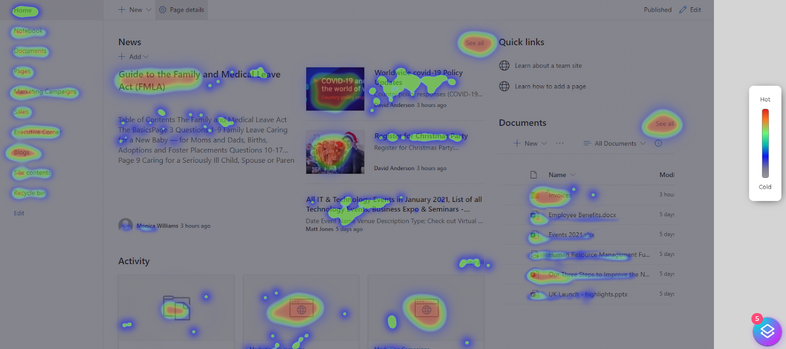
Heat maps collect data from a SharePoint page and displays that data over the page itself. SharePoint heatmaps visualize the most popular (hot) and unpopular (cold) elements of a page using colors on a scale from red to blue. By aggregating user behavior, heatmaps facilitate data analysis and give an at-a-glance understanding of how users interact with an individual SharePoint page - what they click on, scroll through, or ignore - which helps identify trends and optimize for further engagement.
How to
Use Heat Maps
Move maps track where users move their mouse as they navigate the SharePoint page. The hot spots in a move map represent where users have moved their cursor on a page - and there is a correlation between where users are looking and where their mouse is. This means that a move map gives you an indication of where users might be looking as they go through your page. As a visual tool, heat maps help you make informed data-based decisions for updating, or (re)designing your SharePoint site so they are useful on a wider business scale.
Heat map analysis gives you a visual overview of where your users click on your page — the more clicks, the brighter the area, creating what we call “hotspots. When you look at your heat map, you can quickly see which areas of the page get a lot of action and which don’t. This can make your stakeholders understand how your SharePoint users are interacting with your site and see what content gets a lot of action/ and also what content aren’t getting any attention at all, so they can take action based on that. By simply seeing where on the page people click, you can determine if you need to move any of the images around and make the right course of action clearer and easier to find.
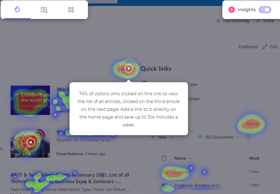
Heat Map Insights
Beyond just the hot and cold zones, our Augmented Analytics also adds some actionable insights, telling you in detail what actions can be taken to make it easier to get to that content which will help to improve your site or content and save a lot of time by doing so.
Using heat maps will help you: