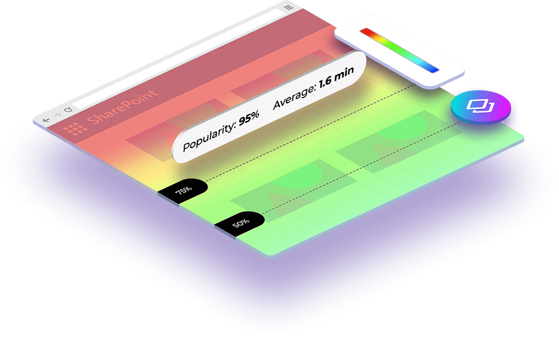
Scroll Map
Optimize your organizations’ SharePoint & Microsoft 365 environments by leveraging scroll maps that allow you to identify problem areas using real data.
Scroll Map
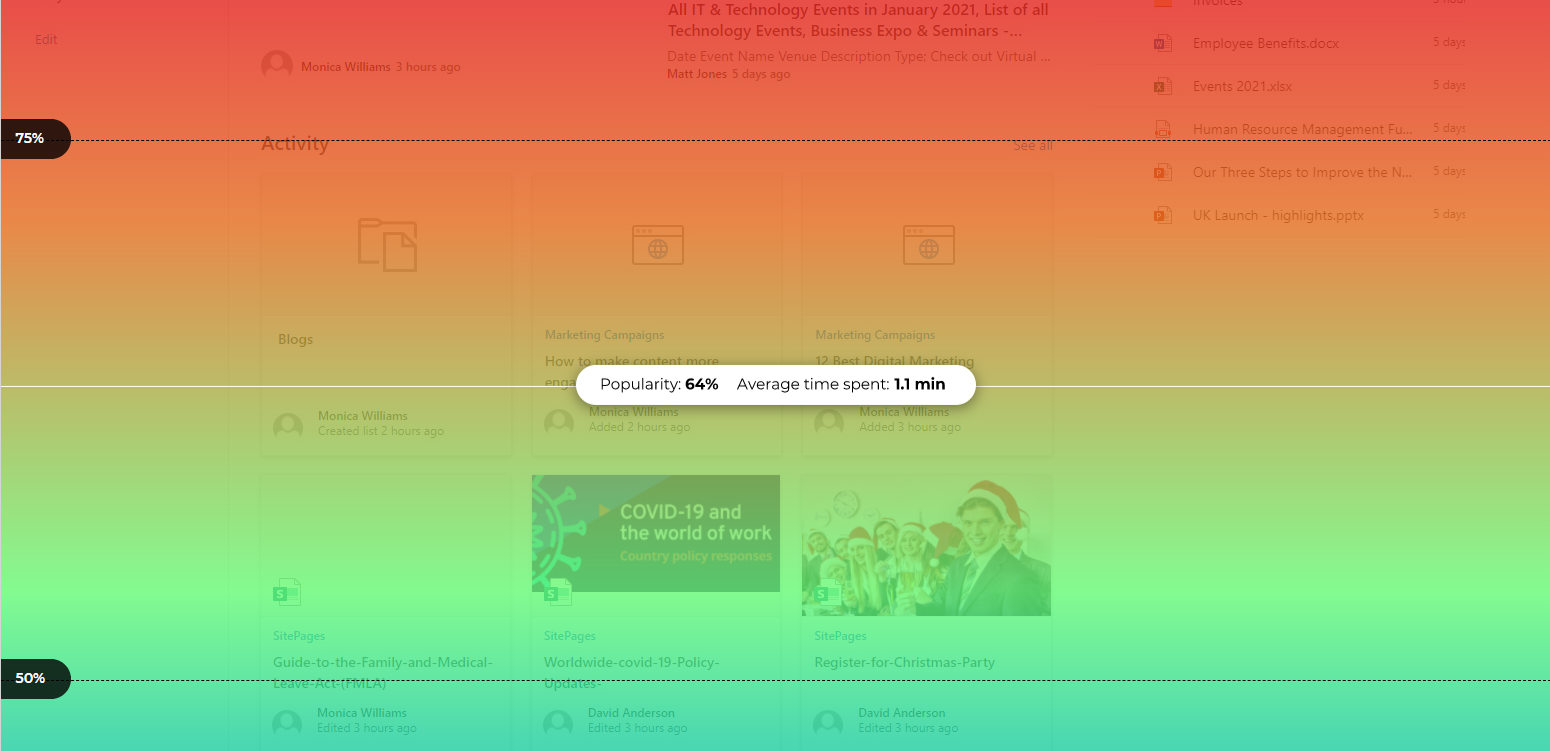
Heat maps are a powerful visual tool for tracking user behavior on your intranet and understanding how users interact with pages and page elements. When you want to find out things like where you’re losing users’ attention or where you should focus visitor engagement, you can use a specific type of heat map called a scroll map. Scroll maps quickly collect data on how visitors scroll through your intranet, so you can spot where on the page you can make improvements or changes, and ultimately increase productivity.
Scroll Maps are widely used by organizations to improve the performance of their SharePoint pages. This tool allows them to identify and select the best SharePoint page length; and at the same time, helps them to optimally place information on the page and strategically prioritize content. By analyzing the data provided by this tool, organizations can tweak their SharePoint page design and information layout to deliver better user experience and improve their users’ productivity and save a lot of wasted time.
What is a scroll map?
A scroll map is a type of site heat map that visually shows how far users scroll down a page. On a scroll map the ‘hottest’ colors show the most viewed sections of the page, rather than the most clicked (or tapped) elements of it. In other words, scroll maps generate heat zones of your SharePoint pages from top to bottom, so they look more like a vertical rainbow instead of depicting the ‘confetti’ patterns typical of other types of heat maps like click or move maps.
How to
Use Scroll Maps
The behavior of SharePoint visitors on the scroll map is defined by colors. Generally, colors like red, orange and yellow indicate the most viewed sections of the SharePoint page, while colors like dark blue, teal or green mean that these areas had lesser views or were hardly seen by the visitors.
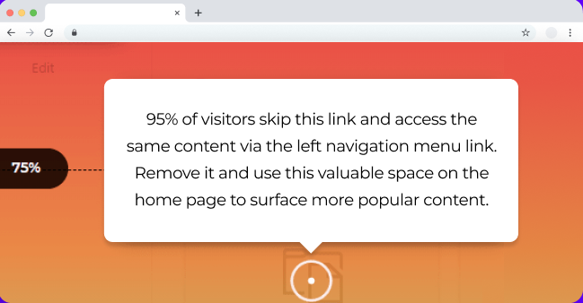
You'll be able to make sure relevant content or links are seen by the vast majority of your users, and most importantly how far users are getting through the page or document before they drop off, which will eliminate any guesswork for exposure level. Based on these findings, site owners and content writers can redesign their site to make the digital workplace more efficient and productive for users.
Scroll Map Insights
On top of the scroll map Augmented Analytics also gives actionable insights that serve as a guiding light for what you should prioritize on your platform to help drive business productivity. These insights connect directly to an action you can take to solve a problem on the platform and it is very easy because it takes you step by step in order to improve your site or content.
Using scroll maps will help you: