
Flying blind in SharePoint? You’re not alone.
Many organizations rely on SharePoint to manage files, collaborate, and communicate—but without clear insights, it’s easy to lose track of what’s working and what’s being ignored. That’s where things get risky: 85% of executives say they struggle to make data-driven decisions due to lack of visibility.
That’s why you need more than built-in reports. You need a way to track the KPIs that actually matter to your team—whether it’s content engagement, site usage, or user adoption trends. CardioLog Analytics helps you build custom dashboards that translate your SharePoint activity into real, actionable intelligence.
Here’s how it works.
Why KPIs Matter in SharePoint
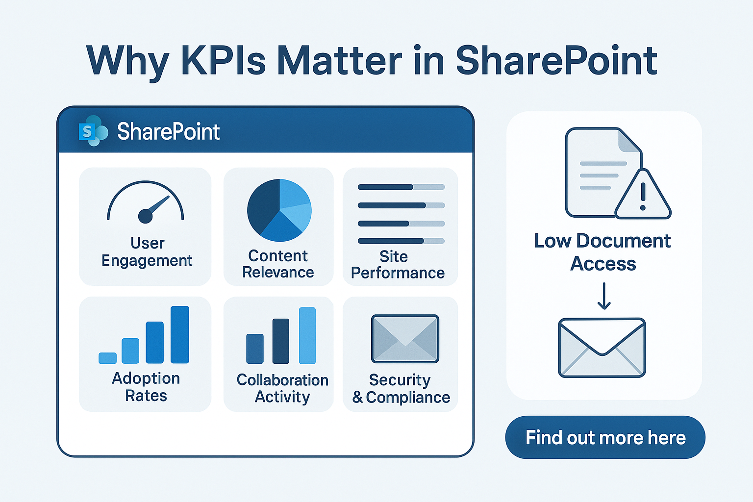
KPIs help you measure how well your SharePoint environment is performing. They offer real-time feedback on:
- User engagement
- Content relevance
- Adoption rates
- Collaboration activity
- Site performance
- Security and compliance
For example, if your team uses SharePoint for managing project documents, a low document access rate could mean poor adoption—or worse, that people are still emailing files.
By identifying the right KPIs and putting them in front of decision-makers, you improve communication, productivity, and accountability.
What Makes CardioLog Dashboards Different?
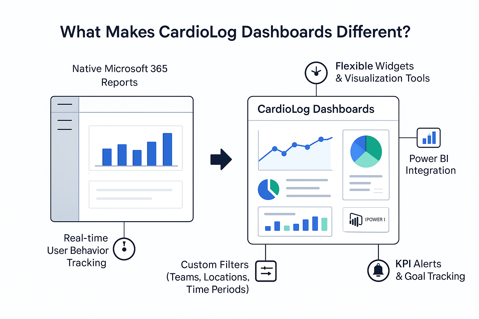
Unlike the native Microsoft 365 usage reports, CardioLog offers deeper, more customizable analytics for SharePoint
Key benefits of CardioLog dashboards:
- Real-time tracking of user behavior
- Flexible widgets and visualization tools
- Custom filters for teams, locations, and time periods
- Integration with external BI tools like Power BI
- KPI alerts and goal tracking
How to Build a Custom Dashboard with CardioLog (Step-by-Step)
Let’s walk through how you can create a dashboard tailored to your SharePoint environment.
1. Define Your Business Goals
Ask yourself: What am I trying to improve? Here are a few examples:
| Department | KPI Goal | Example |
| HR | Onboarding content engagement | % of new hires who accessed onboarding pages |
| Sales | Proposal template usage | Number of downloads of sales deck |
| IT | Site performance | Avg. page load time under 3 seconds |
2. Choose Relevant KPIs
Here are some useful SharePoint KPIs to consider:
| KPI Name | What It Measures |
| Page Views | Popular content or landing pages |
| Unique Visitors | How many individual users visited |
| Session Duration | Time spent on SharePoint |
| Search Queries | What users are looking for |
| File Downloads | Most downloaded documents |
| Site Abandonment | Pages with low engagement |
| Mobile Usage | % of users on mobile devices |
Real Example:
A Fortune 500 company noticed that 60% of intranet traffic came from mobile devices. They used CardioLog to optimize mobile UI and saw a 23% increase in page retention.
3. Use Drag-and-Drop Widgets
CardioLog makes it easy with drag-and-drop widgets. You can display KPIs as:
- Bar charts
- Line graphs
- Pie charts
- Heat maps
- Data tables
Tip: Use color coding to show performance—green for meeting goals, red for underperforming.
4. Filter by Departments or Locations
Want to know if the Sales team in Mumbai uses SharePoint more than the one in New York? Use CardioLog’s filtering system to break down data by:
- Department
- Office location
- Device type
- User role
- Time period
Real Data Insight:
One global company discovered that their London branch used SharePoint 2x more actively than their Chicago office. The dashboards helped management identify training needs.
5. Schedule Automated Reports
Dashboards aren’t just for you—they’re for your stakeholders. CardioLog lets you schedule weekly or monthly reports to automatically send KPI updates to:
- Team leaders
- IT administrators
- HR managers
- Executives
🕒 Save time and keep everyone in the loop with just a few clicks.
6. Set Goals and Alerts
Want to increase employee engagement by 25%? Set that as a KPI goal. CardioLog lets you track progress over time, and even trigger alerts if numbers fall below expectations.
Example:
If daily unique visitors drop by 30% in a week, you can receive an automatic alert to investigate.
7. Compare Performance Over Time
Track SharePoint usage trends month-over-month or year-over-year. Spot patterns and optimize accordingly.
Real Use Case:
After launching a new SharePoint intranet, a company used CardioLog to compare usage before and after. Result? A 65% boost in internal content access within 3 months.
8. Share and Embed Dashboards
You can share dashboards via email, export them as PDFs, or embed them into SharePoint pages. This means KPIs are always accessible to the right people at the right time.
Real-World Results from CardioLog Users
Here are some real numbers reported by organizations using CardioLog for SharePoint analytics:
| Organization Type | Improvement |
| University Intranet | 40% rise in student portal usage after dashboard-based content restructuring |
| Large Retailer | Identified underused content, saving 200+ man-hours/year by decluttering |
| Government Agency | Improved internal newsletter engagement by 32% after dashboard testing |
Best Practices for Visualizing SharePoint KPIs
- Keep dashboards clean and uncluttered
- Focus on 5–10 core KPIs per dashboard
- Update goals quarterly
- Combine quantitative + qualitative data (e.g., surveys)
- Use heatmaps for visual navigation analysis
Bonus: Security & Role-Based Access
Not everyone needs access to all dashboards. CardioLog allows role-based visibility—so HR can see HR KPIs, while IT gets performance and uptime stats. This keeps data safe and relevant.
Final Thoughts: Data That Drives Action
Custom dashboards aren’t just for IT. They’re a way for every department to see how SharePoint supports their goals—whether it’s employee engagement, faster collaboration, or better document management.
With CardioLog, you don’t just collect data—you understand it, visualize it, and act on it.
Want to Try It Out?
If you’re ready to see what truly matters in your SharePoint environment, building a custom CardioLog dashboard is the smartest next step.


 Follow @cardiolog